The attraction, for individual investors, to invest in the AIM market was tax. Qualifying shares held for two years were exempt from inheritance tax under Business Property Relief, and since April 2014 AIM purchases have avoided the 0.5% stamp duty charged on the Main Market. The inheritance tax relief was cut from 100% to 50% in the October 2024 Budget and took effect this April, leaving an effective 20% charge. The stamp duty exemption survived, and is arguably now the better of the two, being a certain saving on every trade rather than a contingent one at death.
There are structural attractions too. Small companies get taken over, usually at a premium, and the UK's valuation discount has kept bid activity high: four of the constituents I looked at were acquired and delisted inside the year.
The other attraction: Fama and French found that small-cap stocks have historically earned higher average returns than large-cap stocks. One interpretation is that small companies are riskier, so investors require a higher expected return as compensation, although researchers continue to debate whether the effect reflects risk or behavioural mispricing. Unfortunately the index returns from the AIM 100, and from the AIM All-Share which is not shown, over the past five years have been poor. The AIM All-Share fell 38% over the five years to August 2026. Over the same period the FTSE All-Share rose 40% and the more international FTSE 100 rose 54%, so this is not simply a weak UK market: it is AIM specifically. That may reflect the poor commercial environment over this period for the smaller, more domestic businesses that list there.
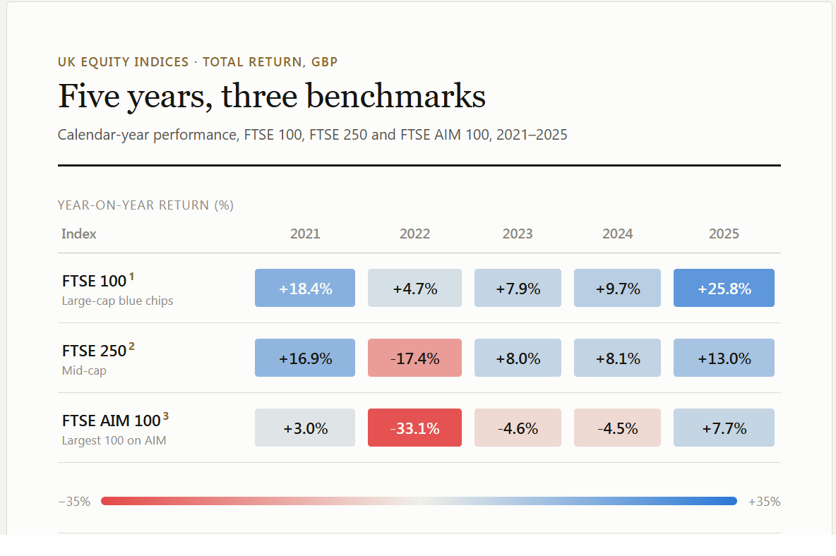
Going on past index performance most investors will probably be looking to cherry pick individual stocks. AIM companies carry little analyst coverage and a much smaller institutional base than the Main Market, so there is more scope to see something the market has not priced. The catch is what it costs to act on it. The median AIM 100 constituent trades about £412,000 of stock a day against £22m for the median FTSE 100 company, and the quietest quarter of the index under £175,000, so spreads are wide and getting in and out is not free. The question, then, is whether there is any way to spot the opportunities, and whether there are tells that would have reduced the downside.
I investigated the period August 2025 to August 2026. The first thing I noticed about the index is that there is a lot of churn. The index rotates at quarterly intervals, and over the year 25 of the 100 constituents were replaced, against about 10% for the FTSE 100 and 13% for the FTSE 250. The companies that left did not all fail. Ten were demoted to the wider AIM market after genuinely shrinking, a median fall of 37%. Seven were promoted up to the Main Market, among them Pan African Resources, which rose 73% on its way to the FTSE 250. The remaining eight left the market altogether, mostly through takeovers.
| Index | Replaced each year | Promoted up | Demoted | Left the market |
|---|---|---|---|---|
| FTSE 100 | 10.9% | — | 30.0% | 70.0% |
| FTSE 250 | 13.7% | 18.5% | 21.5% | 60.0% |
| FTSE AIM 100 | 23.4% | 28.0% | 40.0% | 32.0% |
Turnover measured from archived snapshots of the index constituent lists. Replacement rates are weighted averages over the longest run of usable snapshots for each index: 2.3 years for the FTSE 100, 2.7 for the FTSE 250 and 4.4 for the AIM 100, over which the AIM 100 replaced a quarter of itself every year and did so in the study year too. Destinations cover 4.6 years for the FTSE 100, 2.0 for the FTSE 250 and the study year for the AIM 100. Nothing sits above the FTSE 100, so it has no promotions. Ticker renames look exactly like exits and two were removed from the FTSE 100 count by hand.
With that much rotation, today’s constituent list tells you very little about what last year was actually like. Take the AIM 100 as it is published today, look up a one-year return for each name, and the table is headed by Eco (Atlantic) Oil & Gas at +502%, IQE at +391%, Tungsten West at +371% and Guardian Metal Resources at +221%. Every one of those numbers is correct. But six of that top ten, including all four of those, were not in the index a year ago; they were promoted into it because they had already soared. The best you could actually have owned from the August 2025 list was Anglo Asian Mining, up about 148% over the same period. An index of the largest hundred companies promotes whatever has just risen and demotes whatever has fallen, so its present membership is pre-filtered for last year’s winners. Everything below uses the constituents as they stood in August 2025, not as they stand today.
The index was, as at August 2025, dominated by a handful of companies: the ten largest accounted for 36% of it by market value.
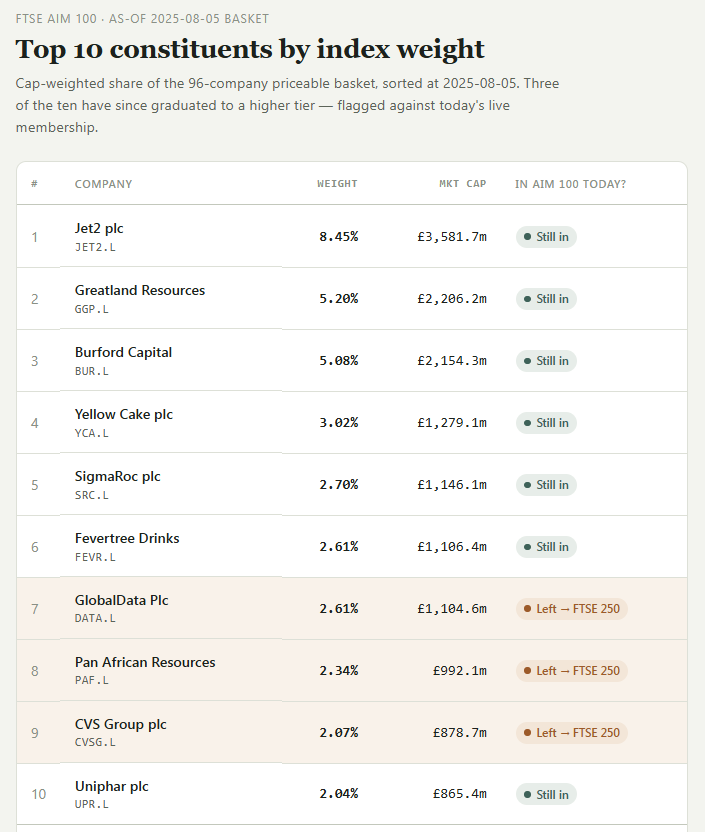
The overall yearly return from the tracker index, if you bought in August 2025, was flat. Names such as Greatland Resources, up 132.7%, had outstanding returns while other large companies such as Burford fell 66.5%.
The returns from August 2025 onwards for a frozen portfolio are shown below. If you had bought a random share at that point, the median return was −2.1%. Also you have to remember that these shares are volatile. The median constituent fell 34% from its own peak at some point during the year.
Below is a graph of yearly returns for those AIM 100 constituents selected in August 2025.
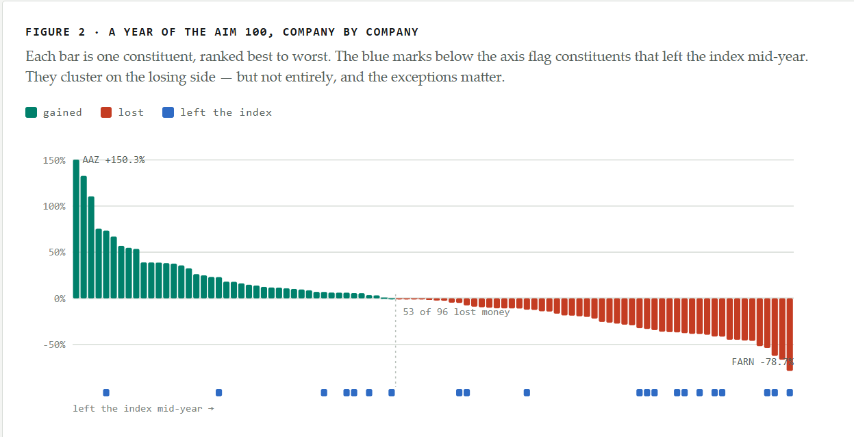
As you can see the index is being carried by a handful of companies with exceptional returns and then there is a long tail of red. Also notice that many of the companies which left the index also cluster to the right. Those companies on the left in green are predominantly precious metal miners.
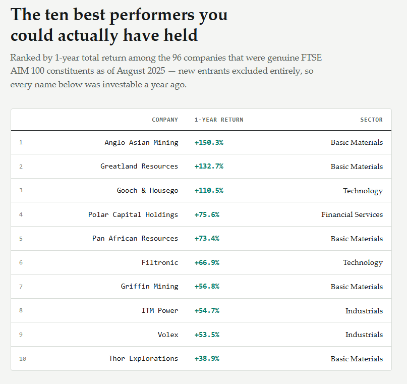
Turn instead to the ten best performers and half of them are miners: Anglo Asian, Greatland, Pan African, Griffin and Thor. Gold ran from about $3,350 an ounce to a peak of $5,318 in late January, a 59% move.
Sector explained more of the outcome than anything else I looked at. Group the resource sectors together and they returned a median 12.0% against −9.4% for everything else. The spread by individual sector is below.
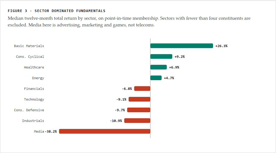
That is a 64 percentage point gap between the best and worst sector, while industrials and technology, a third of the index between them, both lost about 10%.
The knock-on effect is one I had not appreciated. Mining and energy were 35% of index weight in August 2025 and 45% by the index peak in May, having touched 47% in April. A cap-weighted index hands you more of whatever has just gone up, so by the spring the largest single exposure most AIM index investors held was gold. When gold fell 9.7% the miners fell harder and mining and energy accounted for 7.1 of the 8 points the index gave up.
Which brings me back to whether there are any tells worth screening on to identify individual stocks. I tested eight of the obvious ones. Every one came back as noise, with no rank correlation near significance and no quintile spread that survived the sample size.
| Factor | n | Rank correlation | p |
|---|---|---|---|
| Market capitalisation | 91 | +0.10 | 0.34 |
| Revenue | 88 | +0.13 | 0.22 |
| Price to sales | 87 | −0.15 | 0.16 |
| Net debt | 91 | +0.16 | 0.13 |
| Net debt to market cap | 91 | +0.16 | 0.12 |
| Composite risk score | 91 | −0.04 | 0.68 |
| Altman Z score | 81 | +0.07 | 0.53 |
| Piotroski F score | 91 | +0.11 | 0.30 |
The closest any of them came was net debt to market cap, at p = 0.12. On ninety-odd companies, that is what noise looks like.
The one measure that did carry information was volatility. I sorted the constituents into quintiles by the volatility of their daily returns over the twelve months before August 2025. Drawdown then stepped down in order across every quintile, from a median 27% in the calmest fifth to 44% in the most volatile. Volatile stocks stay volatile.
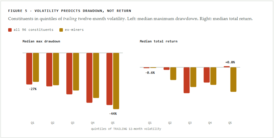
Against return it predicted nothing, as the right-hand panel shows, where the quintiles run in no order at all. If you bought those volatile stocks you bore the volatility and were not paid for it. Volatility is not a selection signal and will not tell you what to buy, it is a position sizing input. It tells you how deep the worst moment is likely to be, and a share in the top quintile needs sizing so that you can sit through a 40% drawdown rather than be shaken out at the bottom of it.
The one thing that did look like an edge was the churn itself. Companies promoted into the index kept beating the ones already there after admission, not merely before it. The obvious objection is that new entrants are disproportionately miners — about 30% of them against 15% of incumbents — and mining beat everything else in every window I looked at, by between 14 and 40 points. But the gap survives taking the miners out: 12 points rather than 14. What does not survive is the absolute return. Strip the gold and the median new entrant returned −0.3%, against −12.1% for incumbents. Entrants did not climb; they fell less far.
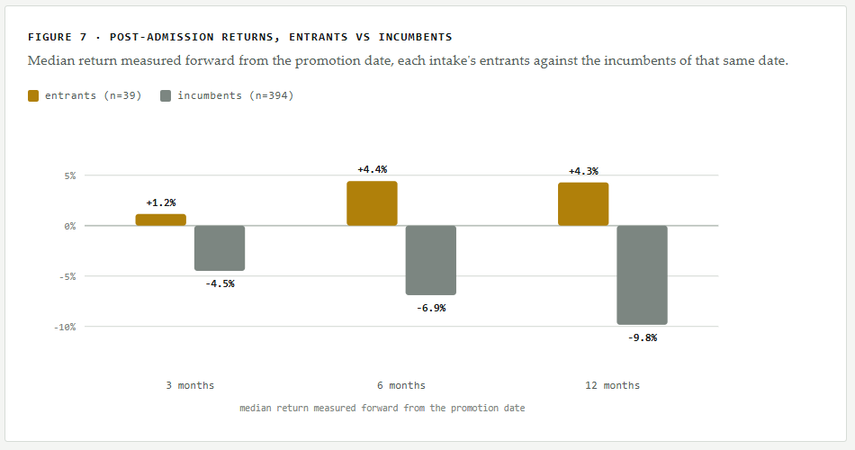
I would not call it proven. It rests on 39 promotions spread across four entry dates, and the cohorts are small — twelve, seven, three and seventeen — with one of the four actually negative. Six further companies were promoted into the index but disappeared from the price data before I could measure them, mostly through takeovers. A company bought out at a premium would have posted a good return, so their absence understates both groups; it happened at much the same rate to entrants as to incumbents, so it does not explain the gap between them. Worth following rather than a strategy.
So, to answer my own question. I do not think there was a screen that would have helped here: the balance sheet measures, the quality composites and the distress models all failed over this window. What mattered was sector, which you can see without a model, and volatility, which told me the size of the drop to expect. Check what you are actually exposed to before concluding that you are diversified, because a spread of these names probably leaves you holding a gold position and a technology position and not much else, and size each holding on the assumption that it will at some point be down by a third, because the median one was.
A note on method. Constituents are those of the FTSE AIM 100 as at 5 August 2025, recovered from archived snapshots of the index membership rather than taken from today’s list, which is the distinction that makes most of the above possible. Prices are adjusted for splits and dividends. Four of the hundred could not be priced because they were acquired or taken private during the year; since takeovers complete at a premium, their absence pushes the median return down slightly.